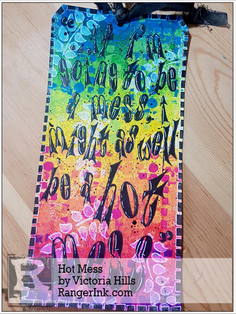
Hi, it’s Victoria…I’m delighted to be here today, taking you through the way I put together this Dylusions Mixed Media Journaling Tag. I really like this quote by Mindy Kaling and have wanted to incorporate it into a journal spread or tag for a while. I knew that a vibrant colour scheme would suit it down to the ground, and that the Dylusions Ink Sprays and Paints would lend themselves to it perfectly – it never ceases to amaze me how the colours pop. I’ll often stencil over the ink sprays with the matching paint colours: you get some great effects. I loved making this tag – I hope it inspires you to try something this vibrant too!

Hot Mess by Victoria Hills
- Dylusions Journaling Tags : #12 Mixed Media
- Dylusions Ink Sprays : London Blue, Fresh Lime, Lemon Zest, Squeezed Orange, Bubblegum Pink, Crushed Grape, Black Marble
- Dylusions Paint : London Blue, Fresh Lime, Lemon Zest, Squeezed Orange, Bubblegum Pink, Crushed Grape, Black Marble, White Linen
- Dylusions Stencils : Small Squares, Small Fresh Dots, Small Skulls, Small Fronds of Foliage
- Dylusions Journal Block
- Dylusions Cling Mount Stamps : Dy's Alphabet
- Dylusions Clear Stamps : Clearly Alpha
- Dylusions Paint Pens : Black Marble, White Linen
- Dylusions Large Creative Journal
- Ranger Non-Stick Craft Sheet™
- Ranger Mini Blending Tool with Foam
- Archival Ink™ #0 Pads : Jet Black
- Fude Ball Pen : Black
- Ranger Heat it™ Craft Tool
- Fine Paintbrush e.g. Round 1 or 2
- Scrap Paper
Instructions

Step 1: Choose your colour scheme. I wanted to create a bright, vibrant tag to complement the quote, so chose six colours that blended together to make a rainbow effect.

Step 2: If you’re anything like me and are not the neatest when using the ink sprays, cover your work area generously with clean scrap paper. I simply taped some plain white printer paper together.

Step 3: Starting at the top of the tag, spray your first band of colour – I began with London Blue. I wanted to create a textured look as opposed to ending up with a solid background, so applied the ink spray in short, light bursts, and held the bottle about 8-10 inches above the tag. You can see how the ink is already starting to create texture: some of the drops are relatively large, whereas in other places the spray looks much mistier.

Step 4: Apply your second colour in the same way. It’s difficult to be precise when you’re spraying, however if you aim to sit the second band of colour just under the first, the inks will blend where they overlap, and you’ll create a natural, unique effect. My second colour was Fresh Lime; you can see the way in which it has blended with London Blue to make a darker green.

Step 5: Continue down the tag in the same way, working through your colours. I followed Fresh Lime with Lemon Zest…

…and then some Squeezed Orange.

My fifth colour was Bubblegum Pink…

…and I finished with a narrow band of Crushed Grape.

Step 6: Because I wanted the bands of ink sprays to blend, I worked relatively quickly and only dried the tag after I’d finished applying all the colours. I used a heat tool, however you could leave it to dry naturally.

Here’s a close-up of the top of the tag once the ink sprays are dry. You can see what a fabulous effect this technique creates – whilst it is textured, it’s still difficult to see where one colour stops and the next starts.

Step 7: The next stage is stencilling. I used a couple of new pages in my large Dylusions journal to rest on whilst I was doing this…it created some great patterns that will be ideal to use as backgrounds for future spreads. I used two pages – one as I was stencilling with the warm colours, and the second for the cool.

Step 8: Starting with your first stencil – mine was Squares – apply the paints in the same order as you did the ink sprays. The key at this stage is to be deliberate in your placement, and avoid mixing colours that will either clash or make an unintended sludgy colour. You can see in the photo above how I haven’t taken the London Blue or Fresh Lime any lower than the Lemon Zest.

Step 9: Continue with your first stencil down to the bottom of the tag, being aware of where you’re placing the paints as you go, and drying one colour before applying the next. NB. I used the foams on their own without the blending tool so that I could be confident I was putting the paint only where I wanted it.

Step 10: Repeat Steps 6 and 7 with your second stencil – mine was ‘Fresh Dots’ – remembering to dry each colour before applying another so that they don’t blend. You can see that I only did a couple of repeats of a three-dot pattern in each colour: I already had quite a lot of squares on the background, and didn’t want to overwork it by adding too much.

Step 11: Repeat for a third time with the next stencil, working again from top to bottom in the same order as before, and ensuring each is dry. My third stencil was ‘Skulls’ – again, there are only a couple in each colour.

Step 12: Use the stencil with the largest pattern last – it’s going to sit over the rest of the background to help bring an element of cohesion; it also means that it will be visible after your text is added. I’ve used ‘Fronds of Foliage’. Starting at the top of the tag, stencil with White Linen paint. I used a new foam after I’d stencilled over the London Blue and Fresh Lime – the first one picked up some of the cool colours, so I wanted to avoid mixing them with the warm colours in the lower half of the tag.

Here’s a look at the tag after the stencilling is finished. Using all these colours and stencils can be quite time-consuming, but I think the effect is well worth the effort. I particularly love the effect of the White Linen as it blends over the different colour ink sprays.

Remember that I suggested doing the stencilling over a Dylusions journal page? Here’s one of the pages I was left with…a great starting point to come back to at a later date.

Step 13: When the White Linen paint is dry, splatter some Black Marble paint over the tag and leave to dry. I wanted small drops of paint so used a fine paintbrush, and used ‘neat’ paint rather than diluting it with water – I like the texture. This does mean however that it can take a while to completely dry.

Step 14: Use a Dylusions journaling block and Jet Black Ranger Archival Ink to stamp the quote. I did a test-run on another tag so that I could be confident I’d got the letter placement and line spacing etc. right, and knew that it was going to be quite a tight fit. Stamping ‘hot mess’ first (actually, stamping ‘mess’ and then ‘hot’!) made it easy for me to position the other four lines of text where they needed to be.

Step 15: The letters need to stand out against this vibrant background, so fill in the letters using either a Black Marble Dylusions Paint Pen, or a fine paintbrush and Black Marble paint.

Step 16: Doodle a border round the edge of your tag. I made mine quite bold so that it held its own against the background and text.

Step 17: Finally, use a White Linen Dylusions Paint Pen to add highlights to your doodled border and text. I also added a white outline to the stencilled ferns to make them stand out even more. Use a piece of black ribbon or fabric to add the final touch to your tag…I didn’t have any, so sprayed a cream piece of ribbon with some Black Marble ink spray, and scrunched it up whilst drying it with a heat tool.

…and here’s the finished tag. I loved making it, and am already looking forward to trying something similar – perhaps a journal page with a more limited colour scheme…the possibilities are endless!


